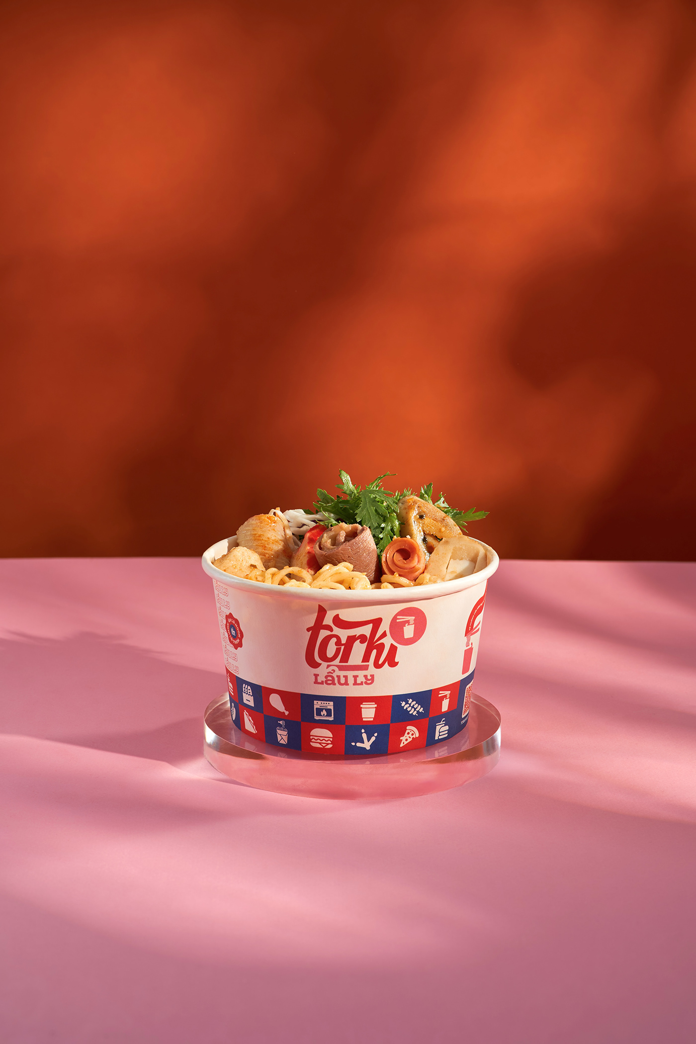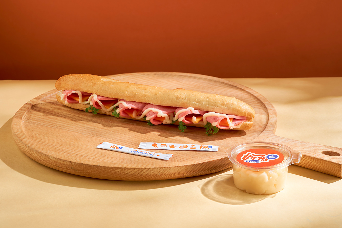
The highlight of Torki’s packaging is its brand logo. The word "Torki" is rendered in a rounded font resembling poured chili sauce, enhancing the perception of deliciousness. Moreover, the strategic use of orange for "Torki" and blue for "Food" serves to stimulate visual perception. The combination of font selection and color scheme ensures that the Torki logo captures customer attention.
Torki Food is a multi-cuisine fast-food establishment, such as hamburger, kebab, fried chicken, spaghetti,... Thus, its packaging is designed with different dimensions to keep various foods, for example, square boxes for hamburgers, flax boxes for pizza, and cylindrical containers for noodles and Hotpot.
One more interesting thing about Torki’s packaging is that each dish has distinctive colors inspired by food ingredients and icons to give signals among dishes. Like the box of fried chicken, it has a butter color and a chicken thigh icon on the front view, and some icons on the left corner represent other chicken dishes. It also has typography about the name dish “Ga ran” (means fried chicken) on the two sides. Another example is a hotpot box, its color is pink and the icon system is the ingredients in the hotpot. In summary, each dish's packaging is uniquely designed (utilizing colors, icons, and typography) to reflect its distinct characteristics.
Overall, Torki Food's packaging embodies a harmonious blend of creativity, functionality, and brand identity. This enhances the dining experience and leaves a lasting impression on customers.


